Monday, September 15, 2008

Feel and Capture

feel

                         ... and capture

                              to bring something

                                                   back
.
.
.
.


Sunday, September 14, 2008

For Mid - Autumn festival

I love collecting and creating small and cute things. It is so interesting.^^ and all these things I will put into a small wooden house which I am making.

Today is mid-autumn festival and i have no plan for this day and now I am staying at home alone. It is so boring.T_T. Therefore, I want make something to refresh my current feelings.

drawings


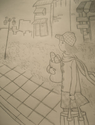
The first picture I drew and painted in Photoshop, and three pictures below I drew basing on " The princess diaries " of Meg Cabot.

I love drawing so much, however i prefer drawing with paper and pencil than with Photoshop or other software. I really love traditional drawings.
With paper and pencil, i can find much more pleasant and inspirations. And they can be my small world.
^____^"

flower


nature

                           after the rain...


Saturday, September 13, 2008

panorama


...
for silly and clumsy something 

Friday, August 15, 2008

Portfolio background


This is a introduction background for my portfolio flash. Firstly, i sketched it on paper and then i scanned it into my PC. I used Brush tool to paint it again. It took me rather long time.~ ~. My friends advised me use other tools replacing brush, but I still like using Brush much more :D.
i really love working with 2D animation, it's so interesting and make me have more motivation for working. 

Some people  looked at my background and told that it looks Japan. I love manga, i love anime, so i really wanna create something like manga or anime. With my portfolio, i wanna create my own something which can also a way describe how my personality is or what my style is.^^.
I am in flash progress, i find rather many difficulties, so i am trying to make everything more simple.

I am in a fight with Flash. T_T

Saturday, August 9, 2008

somewhere we went past


                           somewhere we went past
                      call again...
                                 and 
            call again.


I took it at school on a rainy day last semester , and then i edited a little . At the first time i saw it, I was really attracted. it seems to make me remember  somewhere I went past  and i may feel as if somewhere living in our memory. 
Speaking the truth, i don't like rain, but rainy days often make me have a lot inspirations about something around me and i wanna capture anything i see everytime, everywhere.

.^^.

Friday, August 8, 2008

Black and White Pictures

                        lost

                             juz a feeling...

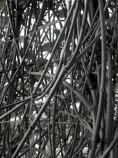
These are two pictures I took a long time ago. I used Photoshop to change their colour. I only used Black and White for them because i wanna emphasize the inside feelings. 

I really love Black and White pictures because they often express strong and profound feelings. 

a small corner to hide...

Saturday, August 2, 2008

Portrait :D


I sketched this portrait on paper, and then I scanned it into my PC. 

I used Brush to paint  it again in Photoshop. I don't have Drawing tablet, and I only used mouse to draw it, so there are some details not good and it took me rather too long.

anyway, i love Brush so much.
.^^.

Saving the tiger poster


This is my poster for saving the tiger.

When I began with this work. I really wanna create a poster which do not include too much violence or blood in it. My inspiration came from Pacman game and I decided to develope my idea basing on it. In that game, Pacman have to eat corns quickly. From that, I sketched my poster with image of death's head which represents for extinction, while tiger heads represent for alive tiger. As you see, death's head could swallow tiger them up as well as Pacman eat corns in the game. Therefore, it is also the message from my poster " Don't let extinction SWALLOW them up ! "

I tried to arrange tiger heads so that it could look to be Pacman game as well. But it seems to be rather difficult. ~_ ~ ., and I had to edit it many times. And the poster above is my final result for Saving The Tiger poster.

Wednesday, July 16, 2008

Funny marshmallows


I bought those marshmallows at the supermarket. Not only they are delicious, but also so cute.^^.

I took a photo. And then with help of Photoshop, I used Brush tool and also change opacity to make them real behind the glass.

Saturday, July 12, 2008

Confession


As you see, original pictures are too bright, and it is warm colour. I am not really satisfied with it , so then I used Photo Filter to change colour.
It is my small dog toy and I took photo for him . Maybe it is a silly funny result.


Friday, July 11, 2008

Panda


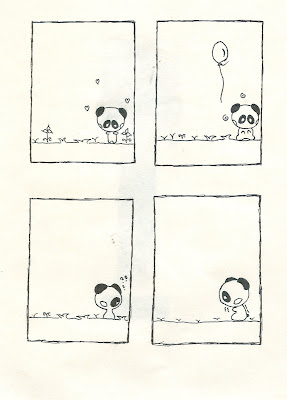
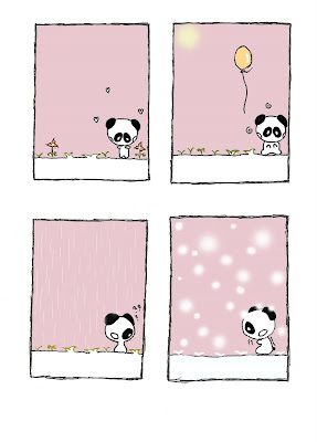
After drawing it, I really want to make it better and impressive. Therefore, i scanned and edited by Photoshop. At this time, I used Brush tool to fill colour, make rain , sun and snow. Maybe I often use simple steps for creating something, but it is rather interesting for me to draw or create something by using Brush.

My work shows emotions or feelings of a small Panda in Spring, Summer, Autumn and Winter.^^.

Monday, July 7, 2008

Story of three dogs


I drew these three dogs basing on a character from a Japanese manga a long time ago.

After that, I scanned it but it is not really good with lots of noise. Therefore, I edited by some simple steps with using Blur tool to make it clearer and then I used Clone Stamp to pick some details from another image that I took from Deviantart website. Moreover, I used  filter tool to change colour and flexibility of background to make my drawing more interesting and lively.

This is my edited drawing with help of Photoshop
And this is my story of three dogs
  • The dog standing on the left: she is preening herself " I'm so beautiful like flowers, huh? "
  • The dog standing in the middle: she is laughing because of her friend's words
  • The dog standing on the right: she is saying" looking at them. It's so terrible, they're so crazy "


Enjoy my work^^


Sunday, July 6, 2008

Fight of Ninjas


I took them from Deviantart website.

After that, I used Select tool and Clone Stamp to make into a different image with a combination of some details from these four images. My inspiration came from Ninjas comic and then I decided to create a image relating with a Ninjas's exciting and funny fight with cheer and worry even disagreement of trees around. Furthermore, I also used the adjustments tools to make background's colour becomes brighter. With this, I hope the scenery in the image will be more real under moon.

And this is my work.^^.


Strange tree

Original


Edited one
I took this photo when i were on the way to school. At the first time I saw it, it really attracted me by a look of strange and mystery, especially its root. Root sticks on the old wall with lots of moss.

However, with the way i took it, and its brightness is not good. Therefore, I edited it by Photoshop with using Clone Stamp , changing Brightness/Contrast and Hue/Saturation to make it have a look of old tree with more full of mystery, especially, I still want to keep strong and powerfulness of tree root. However, I am not really satisfied with the result ,and I think I need to practice more about using the Adjustments tools to make more effective results.